AFTER DARK WITH MALLORY
Link to the blog: https://mallorymariano.com/
My Peer Review #2 is covering Mallory’s “After Dark with Mallory” blog. Upon opening the home page of the website, I was immediately impressed with the clean, postmodern theme Mallory is going with. The home page displays a bold, blocky sans serif title which draws my eyes to the center of the page accompanied by four rectangular images below which convey the overall mood – elegance. This mood is further conveyed by the quote at the top of the page:
““I hope we are all ready to leave the phenomenal world, and enter into the sublime?” – Donna Tartt in The Secret History (1992)”
I noticed that the design choices and visual hierarchy on the home page first draw my eyes to the center of the page, then to the bottom and lastly to the top menu.
Upon scrolling down, Mallory’s blog posts are clearly visible and easy to access, these links are all consistent with one another first stating that they are a review, secondly they display the title and year of the book being discussed, then the author, and lastly the date which each blog was posted. All are shown as text links in a clean, medium-weight sans serif font.
Lastly, scrolling to the bottom of the home page displays a large “NEXT” hyperlink to the far left of the page, in the same block typeface as the title, accompanied by a block arrow stretching across and pointing to the right side of the page.
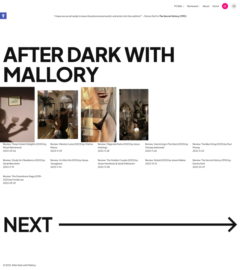
Considering the home page alone I really like the overall layout and design choices made. The website has a plain white background all black text, furthermore, the typefaces chosen are all sans serif. I believe this is a strong design choice as it further reinforces the mood of elegance and modernity. The layout itself consists of a top-down hierarchy with each element/section stretching across the page from left to right with little or no margin space – the images for example touch the left side of the screen – and does loosely follows a grid structure. The choice of bold blocky text combined with perfectly rectangular images work well together to carry the post-modern theme; and having the blocky title at the top with the blocky navigation on the bottom of the page creates a strong sense of balance throughout the page. However, while whitespace is not a bad thing, the lack of visual elements on the right side of the page seem to break that balance and make the page heavy towards the left side, I believe it would be a nice addition if Mallory were to add another bold, black visual element to the right side of the page – in line with the images displayed. As a final critique of the home page, I believe it would improve the overall layout if Mallory were to slightly increase the white space between the bottom of her image and the top of her book review links to create more breathability in this section. Overall, if this home page was to screenshot and printed, it would look nicely in and of itself as a poster.
The usability of this website is very strong, each page being easy to navigate. The menu is clearly displayed at the top right of the page and readable. I specifically like Mallory’s choice to omit having a dedicated “blog” page and replacing it with a dropdown menu in the navigation bar titled “Reviewed”, with each book review easily accessible upon hovering. One suggestion that I’d like to propose is displaying the full navigation menu on her sub-pages – as the sub pages on her website only show “Home” and “About” in the navigation menu. Considering the user experience of someone navigating her website, if they wanted to switch from one review to another, or from about page to a book review/process post – they must always go back to the home page before choosing where they would like to go next. Nonetheless, I really like the design choice applied regarding usability as each link is clearly a link and her menu structure is easy to navigate.
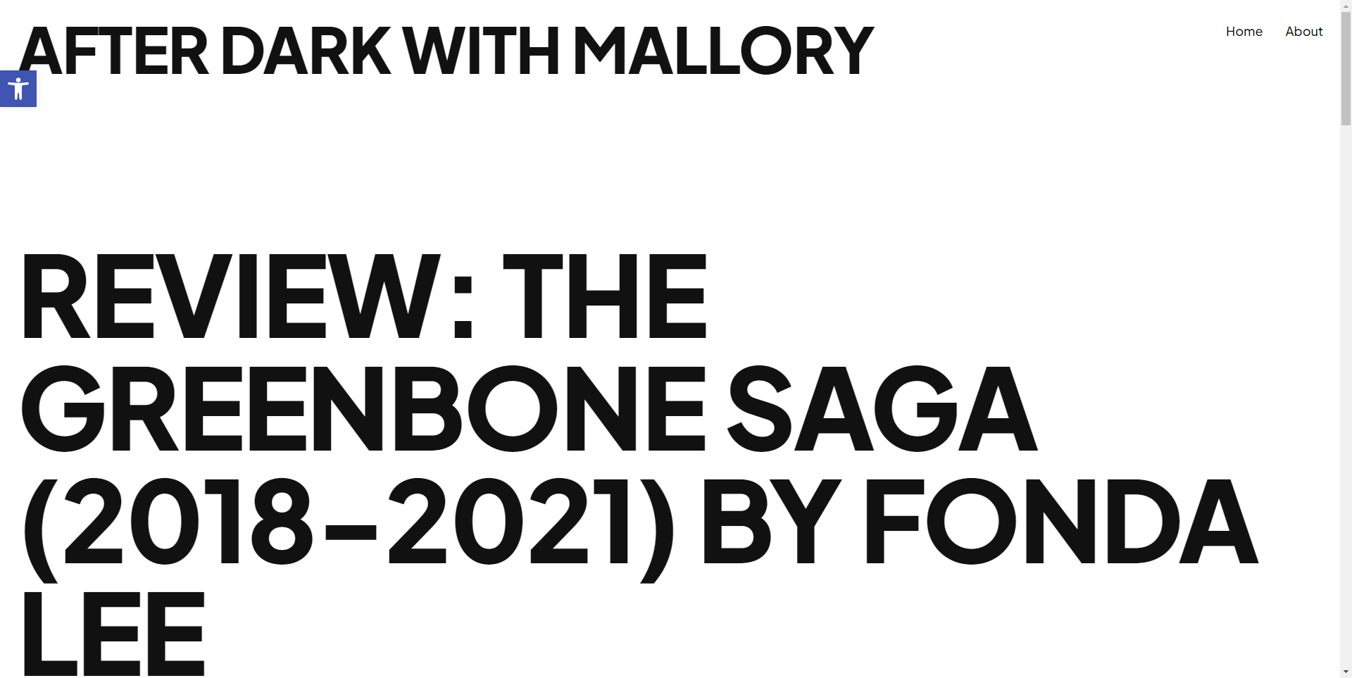
Lastly, when opening a specific blog post or process post, I once again am impressed by the look and feel. We’re first welcomed by bold text showing the post’s title – this combined with the navigation menu take up the entire view height of the screen are very aesthetically pleasing. The posts themselves are nicely laid out with deep margins on the left and right side of the page, compressing the text to the middle of the page making her content very easy to read. Lastly regarding her typography, she has chosen a nice, readable font and applied sufficient line height to her content making the text easy to follow along with. As a final thought, I appreciate that she chose to not use a pure white background and pure black type, rather a slight off-white and off-white as this ensure the contrast is not too high and prevents eye-soreness.
Overall, I really like the look and feel of Mallory’s blog. Her design decisions are strong throughout and strongly support the mood of elegance. As stated, her blog would even look nice in print format!
References:
Warner, Michael. 2002. “Publics and Counterpublics.” in Quarterly Journal of Speech. 88.4.